Color
Intro about implementing color within a single theme and with multiple themes. TBD
Implementing the layering model
There are two ways to implement the layering model within a single theme, either by using explicit layer tokens or smart contextual layer tokens. Both ways are acceptable with different pros and cons that should be weighed in deciding which to use when building your product.
| Token type | Definition |
|---|---|
| Layer set tokens | Explicit tokens used to manually map the layering model onto components. They come in sets based on their level in the layering model and are part of the theme package. |
| Contextual layer tokens | “Magic” tokens that automatically infer value based on the context a component inside the layering model. They are part of the component package and don’t have an explicit value assigned to them. |
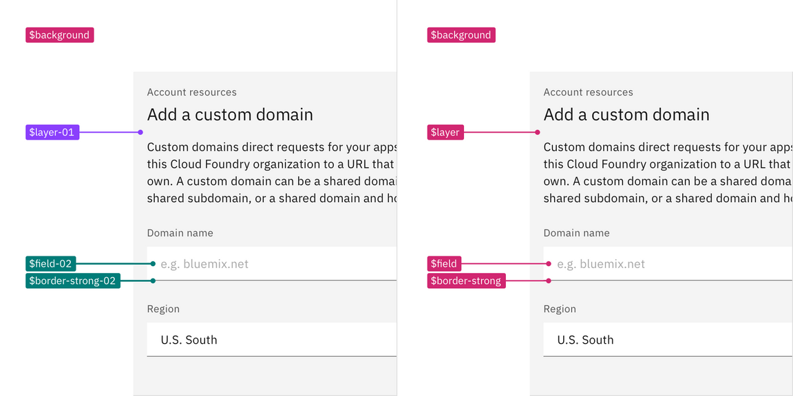
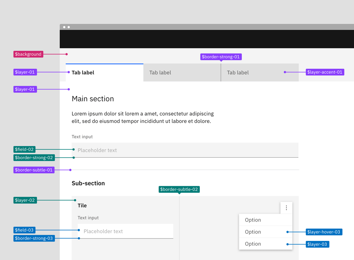
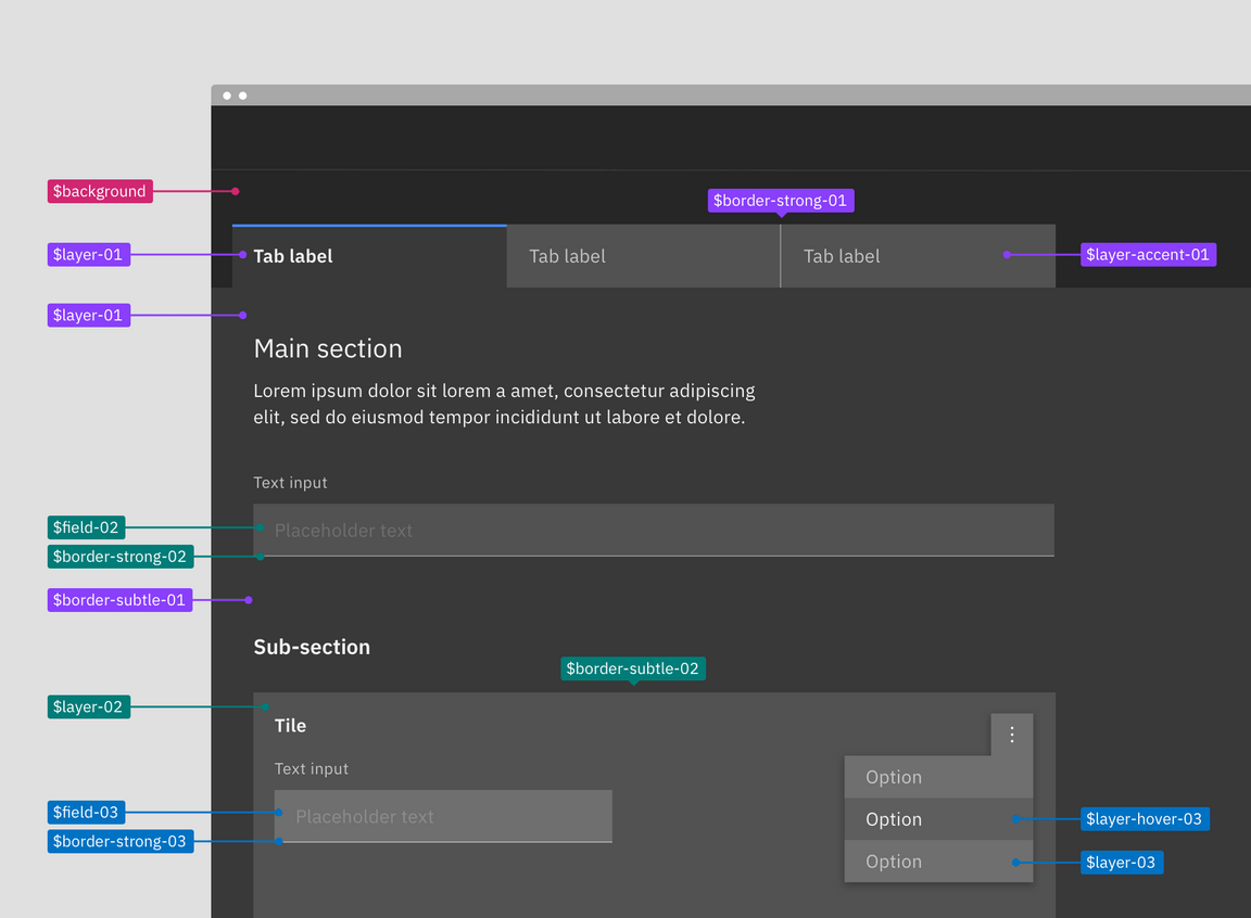
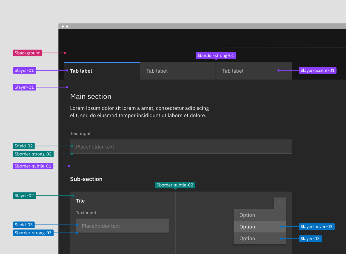
A visual spec using layer set tokens (left) versus contextual tokens (right).
Token list
| Contextual tokens | Layer set 01 | Layer set 02 | Layer set 03 |
|---|---|---|---|
$layer | $layer-01 | $layer-02 | $layer-03 |
$layer-active | $layer-active-01 | $layer-active-02 | $layer-active-03 |
$layer-hover | $layer-hover--01 | $layer-hover-02 | $layer-hover-03 |
$layer-selected | $layer-selected-01 | $layer-selected-02 | $layer-selected-03 |
$layer-selected-hover | $layer-selected-hover-01 | $layer-selected-hover-02 | $layer-selected-hover-03 |
$layer-accent | $layer-acccent-01 | $layer-accent-02 | $layer-accent-03 |
$layer-accent-active | $layer-acccent-active01 | $layer-accent-active-02 | $layer-accent-active-03 |
$layer-accent-hover | $layer-acccent-hover-01 | $layer-accent-hover-02 | $layer-accent-hover-03 |
$field | $field-01 | $field-02 | $field-03 |
$field-hover | $field-hover-01 | $field-hover-02 | $field-hover-03 |
$border-subtle | $border-subtle-01 | $border-subtle-02 | $border-subtle-03 |
$border-subtle-selected | $border-subtle-selected-01 | $border-subtle-selected-02 | $border-subtle-selected-03 |
$border-strong | $border-strong-01 | $border-strong-02 | $border-strong-03 |
Layer set tokens
Layer tokens are sets of explicit tokens used to manually map the layering model onto components. They are part of the theme package and come in predefined sets that pair ui and interaction colors together to accurately match the layering model and enforce correct color contrast.
There are four levels of layering within a theme: base layer, layer 01, layer
02, and layer 03. With each layer of color added you move up to the next
layering level, for example $layer-02 would stack on top of $layer-01.
Notice, not all layer set tokens use $layer as its token base name. Token sets
also include border and field tokens as well as interactive state tokens for
the various layers. Field is considered a layer level and uses the next level
token from the layer it is placed on.
These layer set tokens are identified by a number suffix (-01, -02, -03)
attached to the base token name, such as $field-03. The number indicates which
level or set the token is a part of. Border tokens pair with its same number, so
$field-03 pairs with $border-strong-03 in a text input. Only certain color
tokens are a part of these layering sets. Other tokens for elements like text
and icon work across layer sets. Note: previously in v10 many color tokens
had numeral suffixes, now in v11 only layering tokens will have this
distinction.
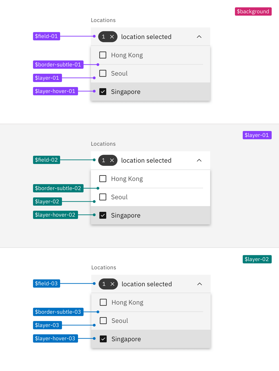
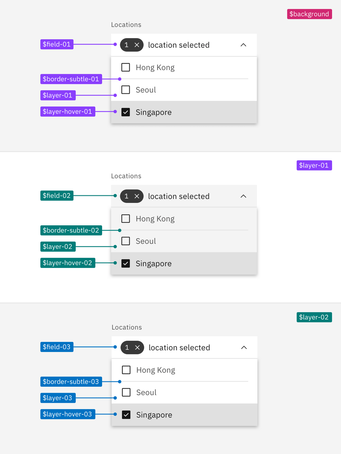
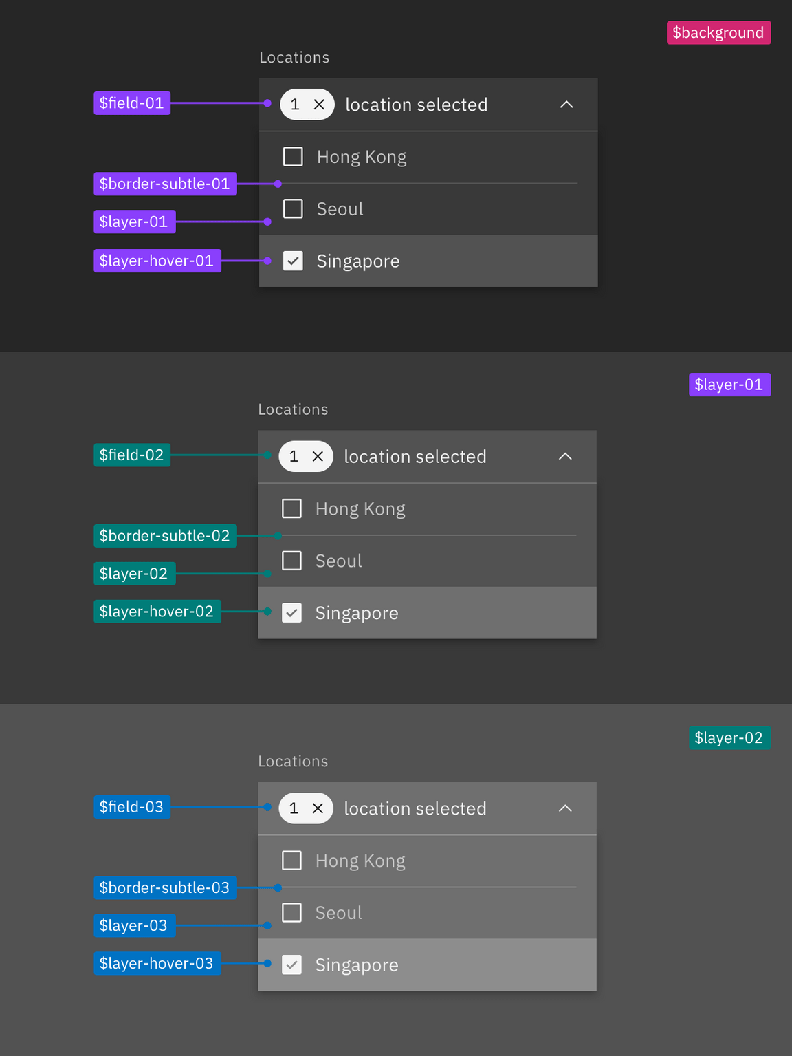
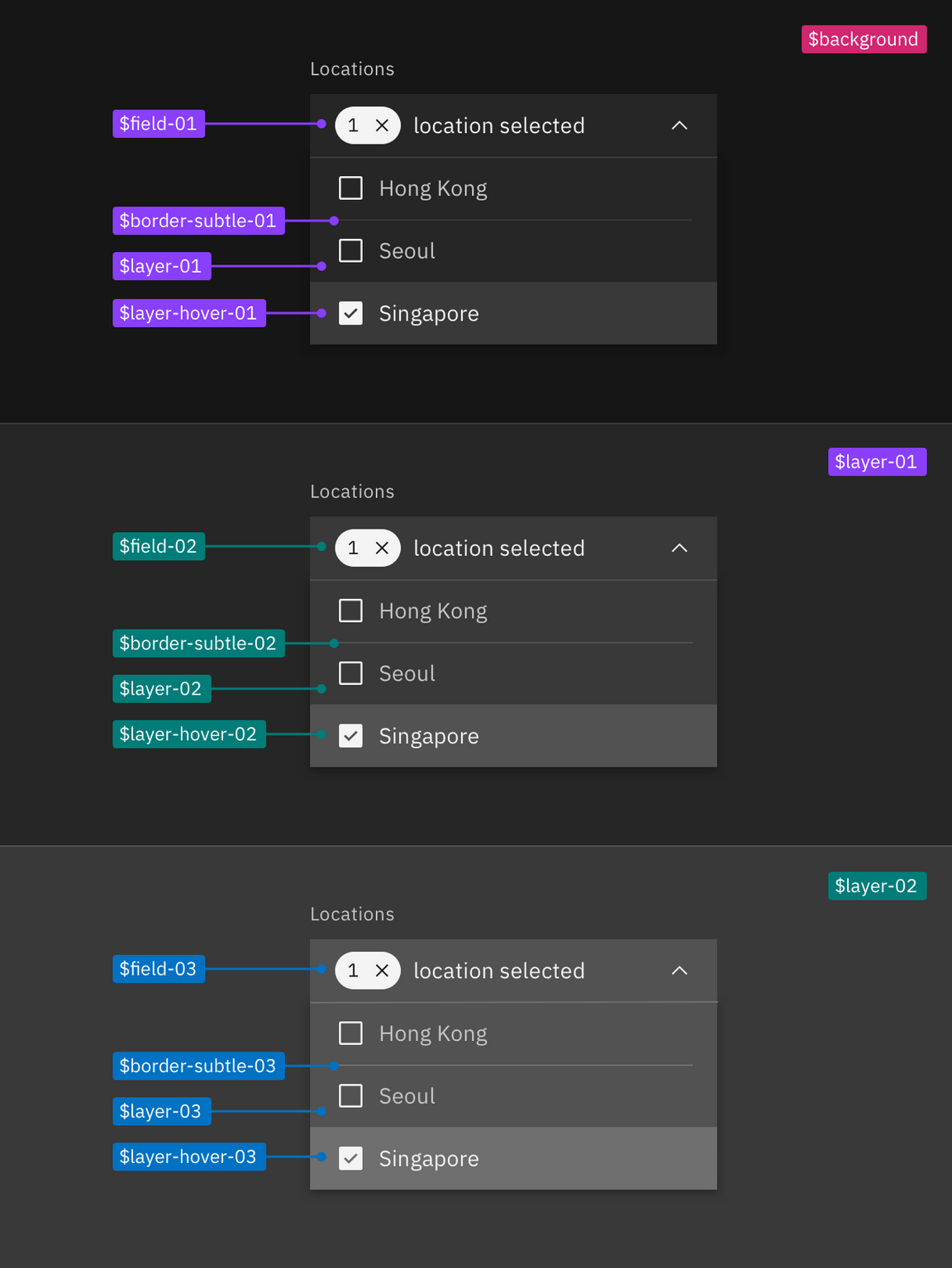
Example of how to apply layer set tokens in a layout
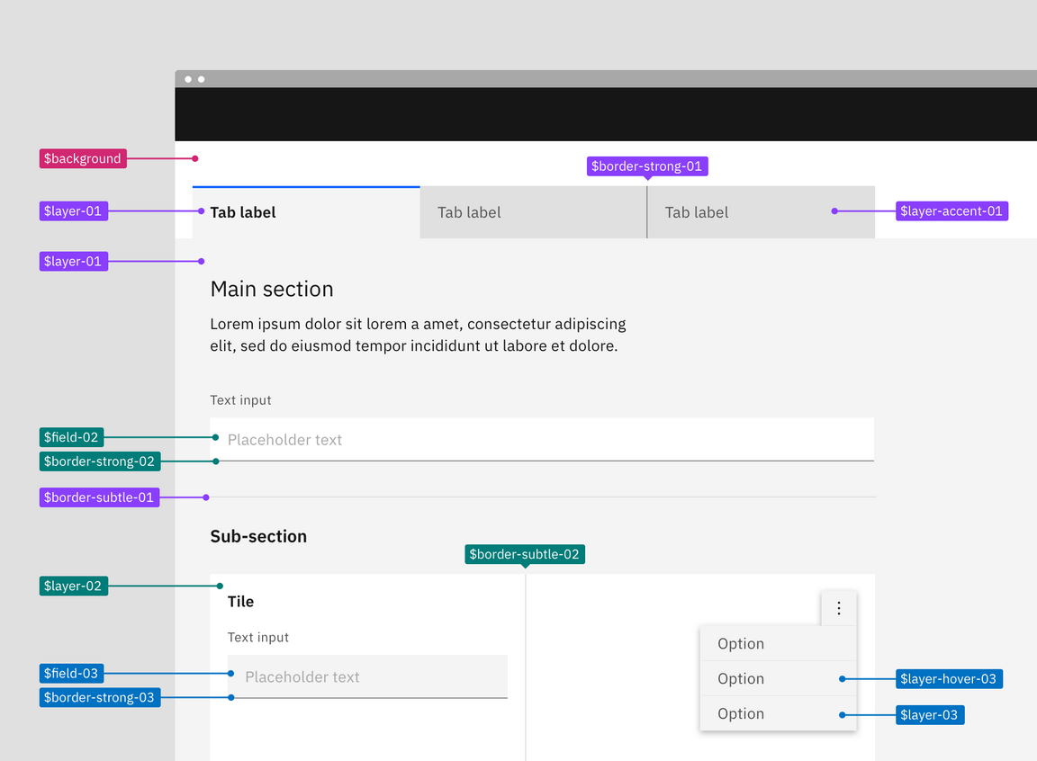
Referencing the image below, the starting base level is the page area behind and
above the tabs; it uses $background from the base set. The tab component is
layered on top of the page background to create the first layer. The selected
tab uses $layer-01 and the unselected tabs use $layer-accent-01 which is not
considered a proper layer but a supporting color for $layer inside of
components. The tab content area attached to the selected tab is also only one
layer above the base and so also uses $layer-01 as its background.
In the tabs main section, the text input field is placed on top of $layer-01
making it a part of the next layer level and will use tokens from layer set 02,
$field-02 and $border-strong-02. Also a part of the second layer level are
the tiles in the sub-section, this includes the tile background $layer-02 as
well as the border between the tiles $border-subtle-02. However, components
added on top of the tiles—the text input and overflow menu—are considered part
of third layer level and will use tokens from layer set 03.
- Base layer: Magenta
- Layer set 01: Purple
- Layer set 02: Teal
- Layer set 03: Cyan
Building components with layer tokens
Building component with layer tokens works much like how you would have built
component variants in v10. For each layer level that a component lives on, a
separate component variation must be built using the explicit layer set tokens.
In v10, these color variants were known as the light prop variants, however
these new layering tokens allows for a three levels color variant in components
that wasn’t possible in v10.
Spec each component variant with it corresponding layer set tokens. For elements that are not part of the layering model like type or icons use the normal color tokens as you would have in v10. These tokens will be the same across variants as they are high enough contrast not to need to change with each layer.
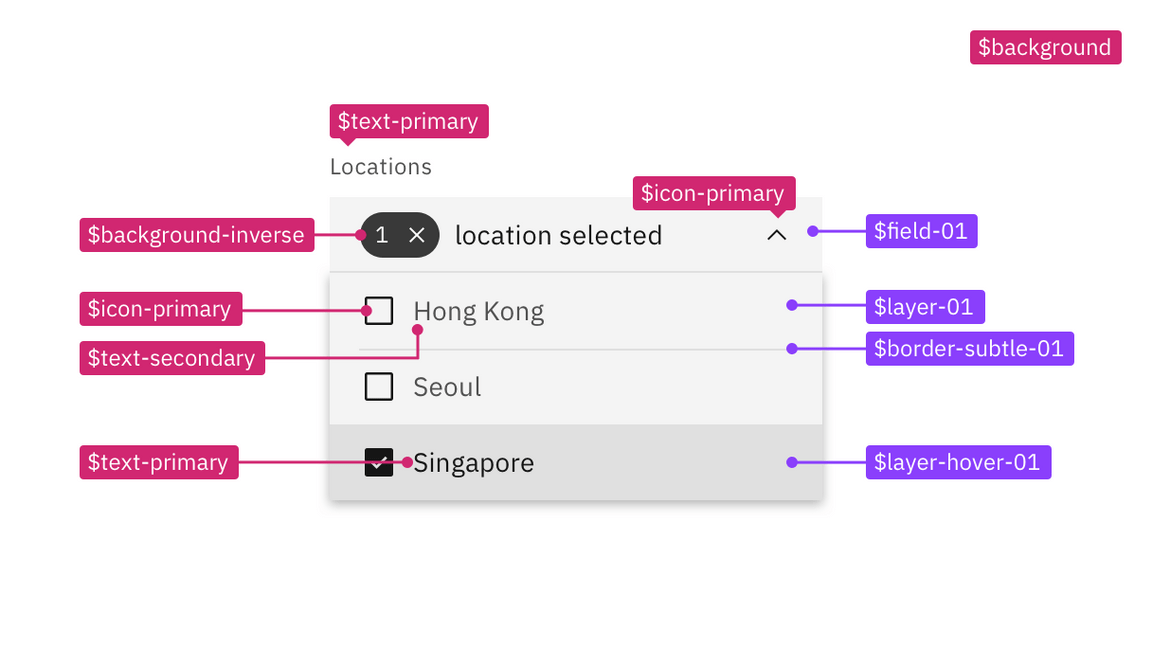
Example component spec in the white theme using the layer set 01 tokens.
Light or dark mode
